When audiences first stepped into the world of Harry Potter, they were transported to a realm brimming with enchantment, history, and mystery. While the spellbinding story and captivating performances played a significant role, much of the immersive magic was woven through the painstaking attention to detail in the visual design—and at the heart of this was the role of graphic design.
The Role of MinaLima in Crafting the Wizarding World
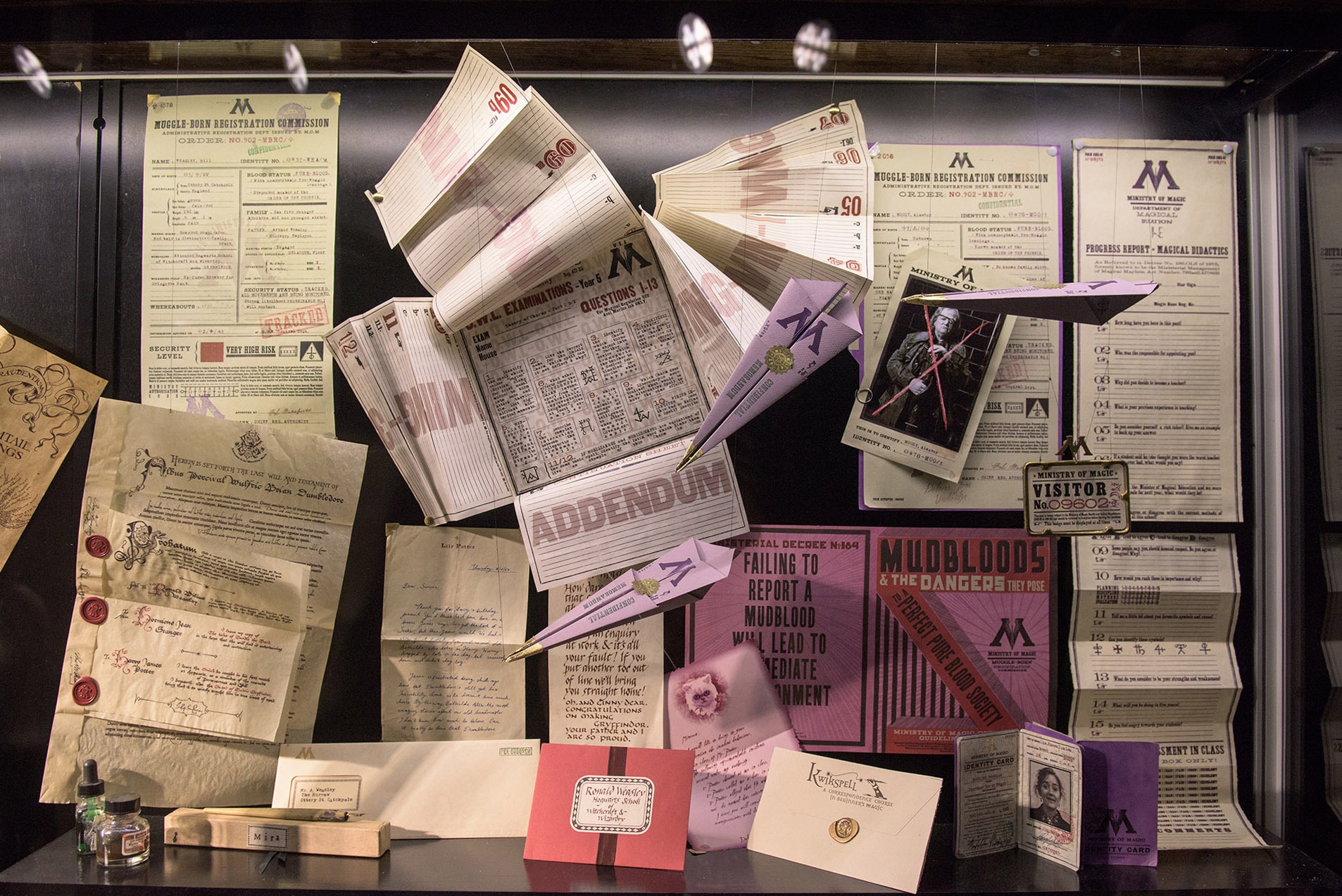
From the very first film, graphic design became an essential tool in constructing the wizarding world. MinaLima, the graphic design duo consisting of Miraphora Mina and Eduardo Lima, brought an unparalleled level of creativity and authenticity to the series. Every piece of graphic design they created—from the Hogwarts acceptance letters to the Marauder’s Map—was a story in itself.

Their designs did more than just add depth to the film’s visuals; they helped define the culture and identity of J.K. Rowling’s universe. The Daily Prophet, for instance, was not just a prop newspaper. Its bold headlines, whimsical typography, and moving photographs communicated the essence of wizarding journalism. Similarly, the retro-inspired designs of Weasleys’ Wizard Wheezes products infused humor and vibrancy into Fred and George’s magical mischief.
Typography as a Storytelling Tool
Typography also played a crucial role in creating the atmosphere of the Harry Potter films. The choice of typefaces often reflected the personality of the characters or institutions they represented. For example, the elegant and gothic type used in Hogwarts documents reflected the school’s rich history and prestige. Meanwhile, the chaotic, mismatched fonts of the Wanted posters for Sirius Black emphasized urgency and disarray.
The influence of MinaLima’s work extends beyond the films.
Even the design of the books within the films—such as Advanced Potion-Making and The Tales of Beedle the Bard—spoke volumes about the wizarding world. These items didn’t just act as background props; they were imbued with character, reinforcing the sense that this was a fully realized world with its own traditions and history.

The Iconic Marauder’s Map
One of the most iconic examples of graphic design in the Harry Potter series is the Marauder’s Map. This intricate prop was more than a plot device; it was a masterpiece of design. Its layered parchment aesthetic, hand-drawn lines, and magical moving footprints perfectly captured the blend of old-world charm and magical innovation.

The map became a fan favorite not only for its functionality in the story but also for its visual appeal. It’s a testament to how great design can transcend its role as a mere tool and become a beloved artifact in its own right.
Timelessness Through Traditional Techniques
What makes the graphic design in Harry Potter so remarkable is its timelessness. Despite the films spanning a decade, the designs never feel dated. This is due to MinaLima’s use of traditional techniques, hand-drawn illustrations, and a meticulous approach to crafting designs that felt both contemporary and rooted in the past.
The influence of MinaLima’s work extends beyond the films. Their designs have inspired countless fan creations, from replica props to themed stationery. Today, the duo continues to celebrate their contributions to the wizarding world through exhibitions and a dedicated shop that showcases their iconic designs.
The Harry Potter movies are a testament to the power of graphic design in storytelling. Every label, letter, and map not only served a narrative purpose but also helped build a world that felt alive and tangible. Through their artistry, MinaLima showed that graphic design is not just about aesthetics—it’s about creating magic.