The U.S. National Parks are known for their breathtaking landscapes, from the towering peaks of Yosemite to the vast deserts of the Grand Canyon. But beyond the natural beauty lies an unsung hero: the graphic design that has helped shape how millions experience these iconic places. From the instantly recognizable park posters of the 1930s to contemporary wayfinding systems, graphic design plays a vital role in connecting visitors with the natural world.
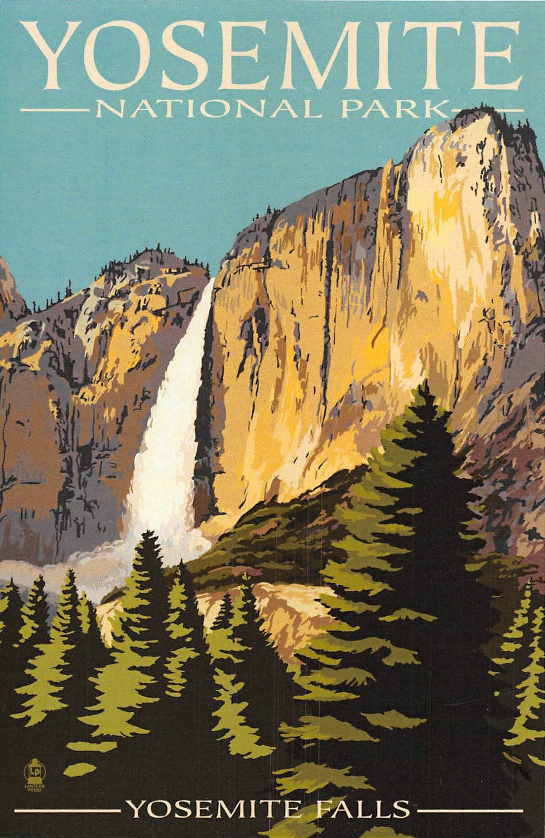
During the 1930s, the Works Progress Administration (WPA) commissioned artists to create posters promoting U.S. National Parks. These silkscreen prints, characterized by bold colors and stylized depictions of landscapes and wildlife, remain iconic examples of American graphic design. The posters’ simplicity and focus on natural features made them accessible to the public and evocative of the parks themselves. Today, they’ve become collector’s items, with modern reprints continuing to inspire new generations of visitors.
Unified Yet Unique: The National Park Service Identity
The National Park Service (NPS) emblem, affectionately known as the “Arrowhead,” has been a cornerstone of the organization’s identity since its adoption in 1951. Featuring a sequoia tree, bison, mountain, and water, the design encapsulates the diversity of America’s natural and cultural heritage. This emblem is more than a logo; it’s a symbol of conservation and stewardship.
Complementing the Arrowhead are other design elements that create a cohesive identity across park materials, including brochures, maps, and signage. The typography used—often clean and utilitarian—reflects the NPS’s mission to communicate clearly and effectively with visitors, whether they’re exploring urban historical sites or remote wilderness areas.

Navigating the expansive U.S. National Parks system requires thoughtful design. Maps, trail markers, and informational signage must be clear, intuitive, and accessible to diverse audiences. Over the years, graphic designers have refined these tools to balance aesthetics with functionality. For example, color-coded trails and universally understood pictograms ensure that visitors of all ages and abilities can safely enjoy the parks.
One notable innovation is the use of the Clearview typeface, designed for legibility at a distance and in varying lighting conditions. It has become a standard for highway signage and is increasingly used in parks to improve accessibility.
Modern Interpretations: Digital and Interactive Design
In the digital age, the graphic design legacy of the National Parks extends beyond physical spaces. Websites, apps, and social media platforms now play a significant role in engaging visitors before they even set foot in a park. Interactive maps, virtual tours, and downloadable guides blend traditional design principles with modern technology, ensuring the parks remain relevant to younger, tech-savvy audiences.
Moreover, contemporary designers often draw inspiration from the WPA posters, creating new artwork that pays homage to the past while embracing modern styles. These designs often serve as digital souvenirs, allowing visitors to carry a piece of the parks home with them in the form of wallpapers or social media graphics.
A Design Legacy Worth Preserving
The graphic design of the U.S. National Parks is more than just a practical tool; it’s a vital part of the visitor experience and a testament to the power of design in shaping our relationship with nature. Whether it’s a vintage WPA poster hanging in a gallery or a trail marker guiding hikers through the wilderness, these designs remind us of the beauty, history, and importance of America’s most cherished landscapes.
As the National Parks continue to evolve, so too will their graphic design. But one thing remains certain: thoughtful, inspired design will always play a key role in helping us connect with and protect these national treasures.